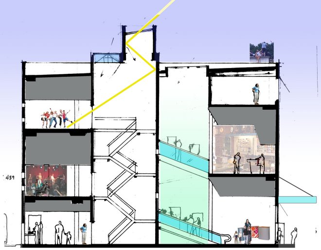
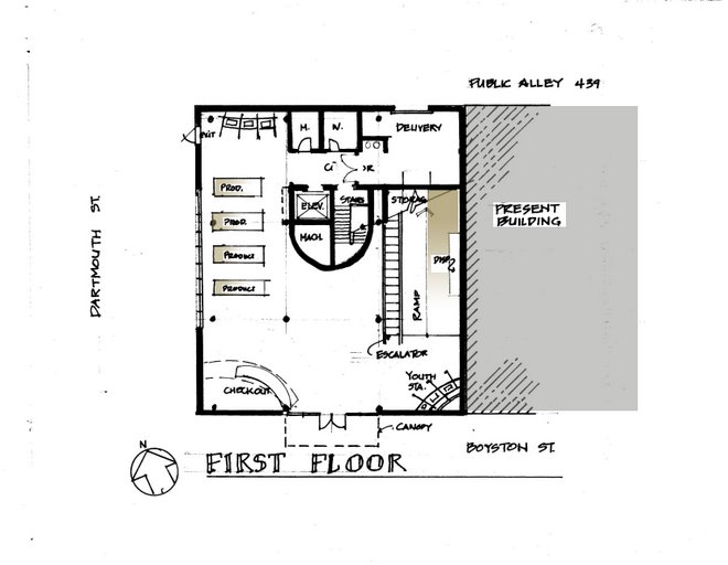
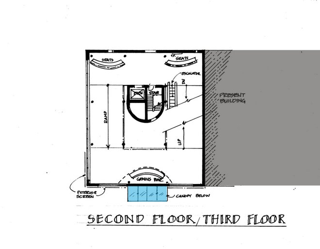
 The interstitial space above the first floor entry from Bolyston street is a location which must provide both interest and utility in the shopping experience. My drawings will indicate the use of flat screen T.V. with continuously changing interest stories or developments in technology to encourage additional shopping. The space will be above the main entry doors and capable of providing delivery of high intensity lighting and mechanical systems.
Since this area is as Paco Underhill suggests is a "transition" area, it is necessary that it provides shoppers with both a sense of security as they enter the store and , when they are ready to exit, an additional opportunity to purchase other items which are related to their primary visit. This critical area will be further detailed with line drawings indicating the clearances expected.


8 comments:
I like how you are already thinking about what you will be detailing and getting it up on the blog for those to give input. I suggest to keep this up and as you move along this week get stuff up so we can see the progress and provide thoughts.
p.s you said you left a comment under my last post but it isn't showing up?
Tom, what if you strung together flat screen continuously like time square, only instead of flowing text, it could be flowing images.
on the outside? and inside?..it can be the Good morning America board for Beantown...GO!
You can attach ATHF advertisements to the outside.
Is this interstitial space your "signature element"? I must admit it is not what I expected you to select. I had assumed, since the focus of your project is about the bringing together of two distinct user groups and providing each a "path", that you would have selected an element which would have afforded you the chance to investigate that concept at a more detailed level. Such as the interior core/curved wall (where you could have explored it as the element that existed between the young (on the interior of the volume) and the old (wrapping/ramping around the exterior). Why did you choose what you chose? I have no issue with you selecting to focus on the interstitial space, but I urge you to develop/consider it in a manner that continues the theoretical underpinnings of your project.
In developing the sketch I have superimposed two layers of information as a test to see if this avenue of design would net any significant detailed design elements. Specifically, my exploraton in retorspect is a bit to technical. Therefore,I will acquess to my original scheme entry level 'captivation and information' which is better suited to the dicotomony of my theme.Thanks Chris!
Tom
Tom,
check my blog, I have some interesting article that can help you defining your "signature element"
I forgot where I got it from
Post a Comment