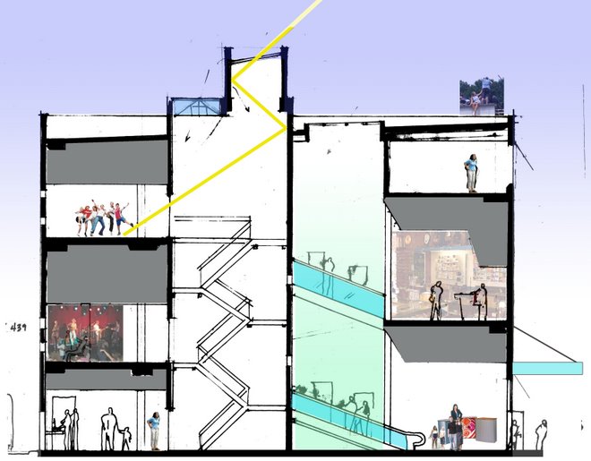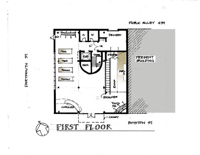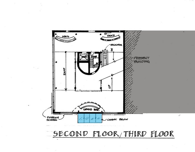
The Section at left is a new element in the interior of the building. It contains the windows as well as the structural edge of the ramp system and floors. Perimeter tube columns will be incorporated into the window wall system through each vertical mullion and will support the wall system and the exterior system of the building. High performance glass will be used (three sides frittered) to reflect annoying glare and direct sunlight. The ramp will be supported by columns with braced beams from the interior core area. Air distribution will be with a profiled high velocity VAV mechanical system on the upper floors and heated slab with electrical chase ways to provide full utilities to the changing displays. The inside of the ramp will contain a glass railing system. Moving walkways and gentle slopes will allow shoppers to visit display as they ramp to the top.


1 comment:
Good start.
But why have a typical hung ceiling drop below the line of the fan supports? Why not simply created a section that achieves the curvature described by the support with the fans occuring periodically (as needed)? What is drawn seems to be in conflict with itself. Imagine a view down this ramp at an angle, ... what is the character of the space/surface?
And how does any of what you sketched or wrote deal with the issue of "different user groups"?
Tom, I am asking you to specifically respond to this question. You seem to be completly skirting the issue of the relationship between the signature element and the basic conceptual/organizational premise of your building. This wall section/detail can (and does) exist anywhere.
Use your concept to give shape/definition to the element. Currently it is just an element. It is not a "signature" element.
Post a Comment